Manahatta
A beautiful, tragic play about how indigenous peoples have faced—and continue to face—widespread exploitation in the United States, emphasizing how history has a real tendency to repeat itself
Brand design Poster design Custom lettering + illustration
The brand
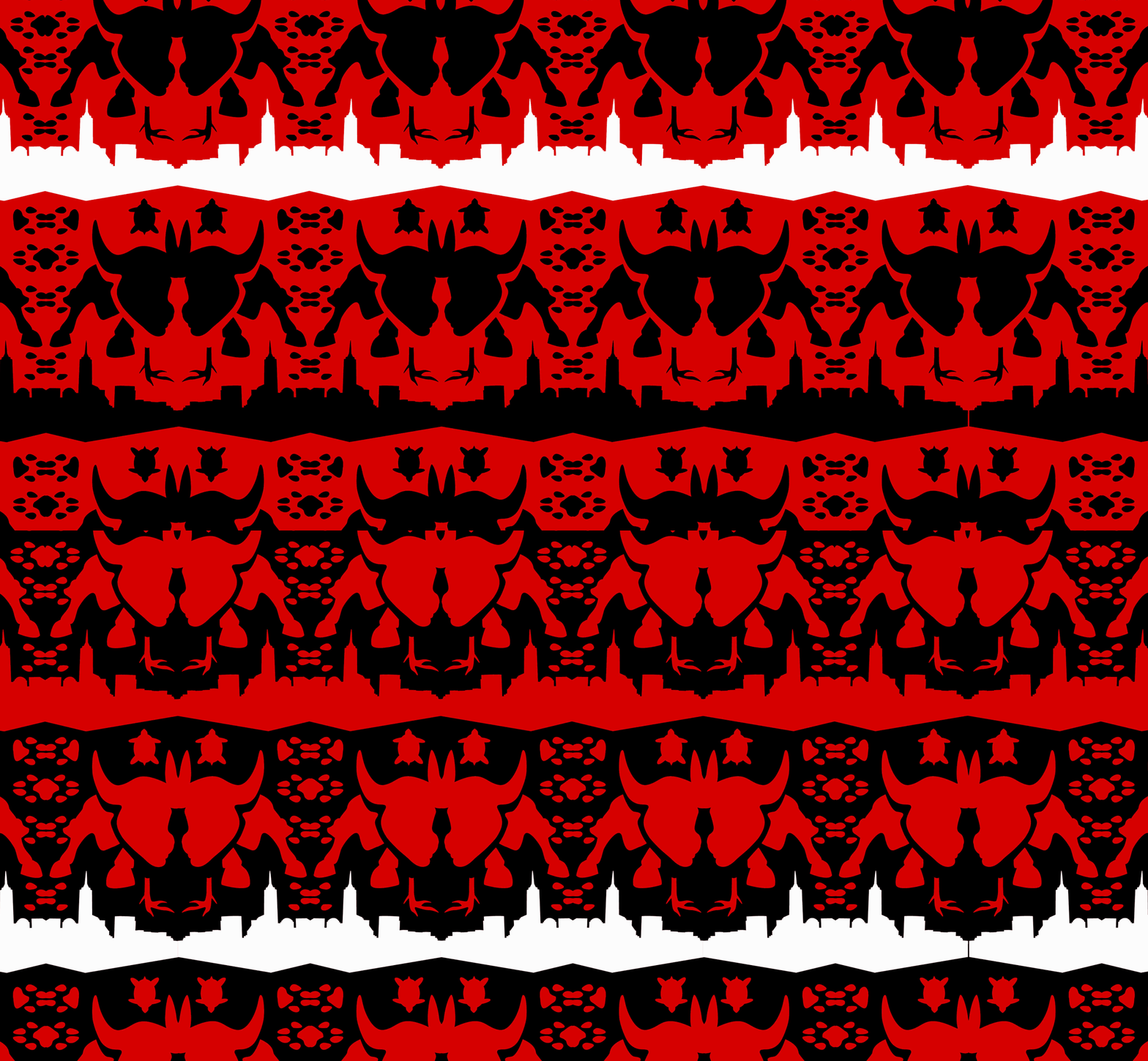
The typography on the poster draws from the NYC subway, and the custom face is based on forms that appear on a Lenape bandolier bag. The pattern incorporates elements from the NYC skyline, the Lenape crest, and the iconic Wall Street charging bull. The red and black are the colors of the Lenape tribe; I used their exact red.
The typeface: deeper
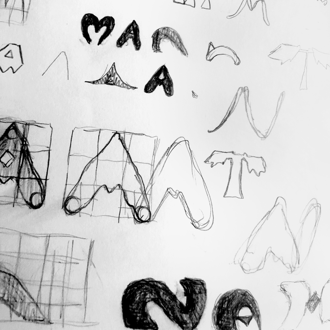
Many of the “Native-American-inspired” typefaces I found on the internet either embraced stereotypes of indigenous peoples or were too general to pay appropriate homage to the Lenape to use for this project—so I decided I was better off left to my own devices. I designed my own letters based on this beautiful pattern from the Lenape bandolier bag.


